HOME
WORK
ABOUT
Web Scraper API
2025
Reduce friction. Accelerate value. Drive conversion.
Company
Bright Data
Timeline
1 month
Role
Senior Product Designer
Responsibilities
Lead Designer • User research • UX • UI
The Team
PM, PMM, Dev Team
What is Web Scraper API?
You are a data-driven professional looking to stay on top of competitor pricing, customer reviews, or hiring trends.But manually gathering that information from dozens of websites takes too much time. Web Scraper API does the heavy lifting for you, automatically collecting and organizing information from over 120 popular websites into a clear, usable format, so you can spend more time making decisions and less time hunting for data.
the problem
Key configuration pages lost 70% of their conversion rate
Step #1 - heuristic evaluation
To kick off the project, I conducted a heuristic evaluation. This helped identify usability issues, frame the key problem areas, and prioritize improvement opportunities. The process also allowed me to align early with the product manager and developers, ensuring we accounted for technical limitations and existing constraints.
At Bright Data, stakeholders are deeply interested in understanding the rationale behind design decisions. Presenting a heuristic evaluation report, paired with usage metrics, served as a compelling way to highlight usability gaps and opportunities for growth. This evaluation laid the groundwork for cross-functional alignment and ultimately informed our design roadmap.
PLG User Journey
During the heuristic evaluation, we discovered a major usability issue affecting our Product-Led Growth (PLG) funnel, particularly right after login. Users were consistently confused between two core offerings, Scrapers and Datasets, due to overlapping terminology and unclear visual hierarchy.
Recognizing that this confusion could hurt user activation and retention, I worked with the team to temporarily shift focus and address the PLG experience. We agreed to quickly prototype and test improvements to clarify this distinction and guide users more effectively through the post-login journey.
Findings
Key Challenges
#1
Unclear messaging
Users were confused between the Web Scraper API and Datasets offerings.
#2
Unexpected results
The existing design lacked basic UX patterns.
Actions often produced unexpected outcomes, leading to user confusion and mistrust.
#3
Confusing navigation
Users struggled to understand where they were in the process due to unclear page titles and unclear CTAs.
#4
Lack of feedback
After running an API call there was not visual feedback to indicate progress, leaving users unsure if their actions were successful.
#5
Cognitive overload
Configuration forms UX asked for too many details upfront, overwhelming first-time users and delaying their "aha" moment
Create quick solution for the PLG flow...
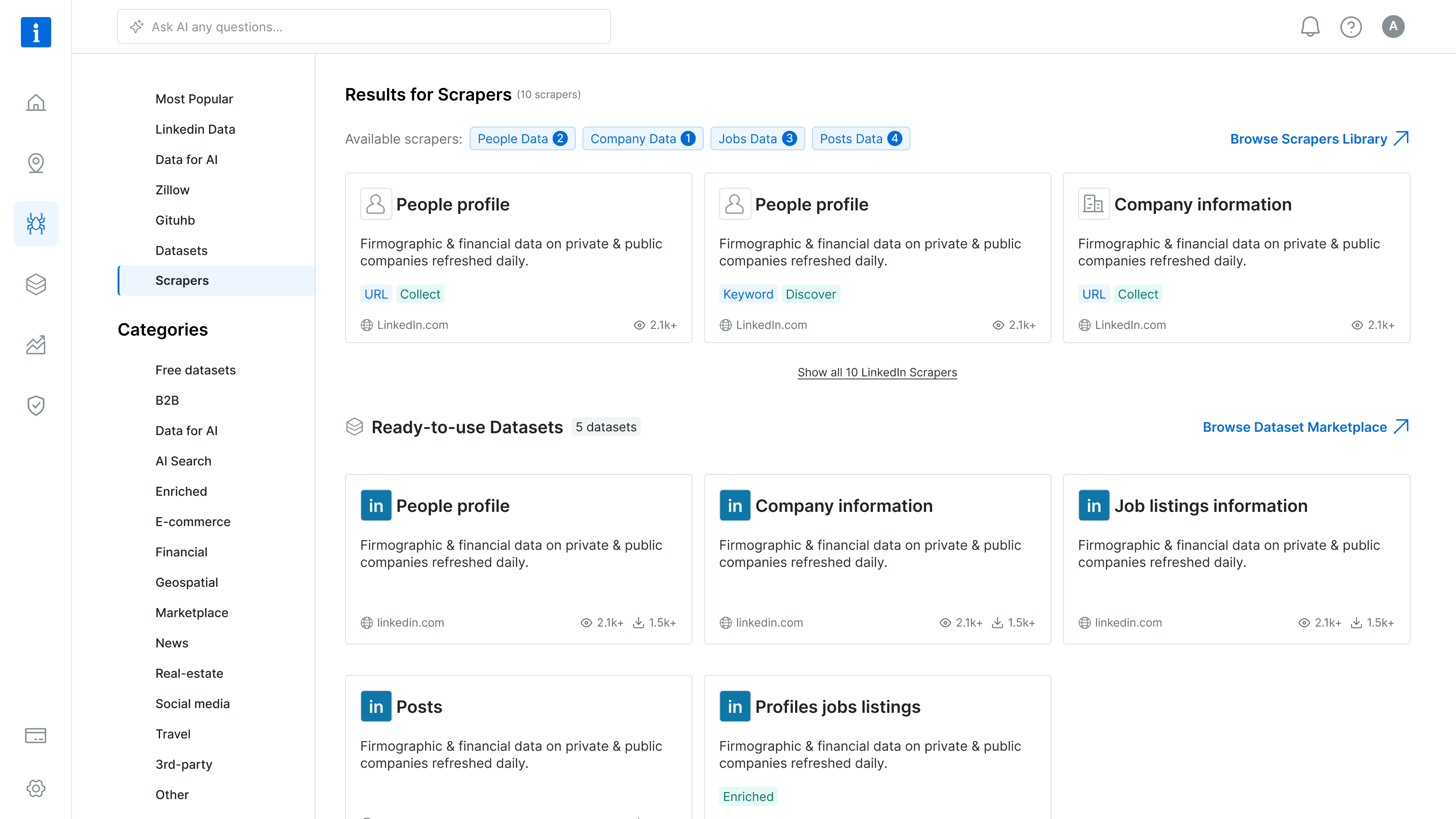
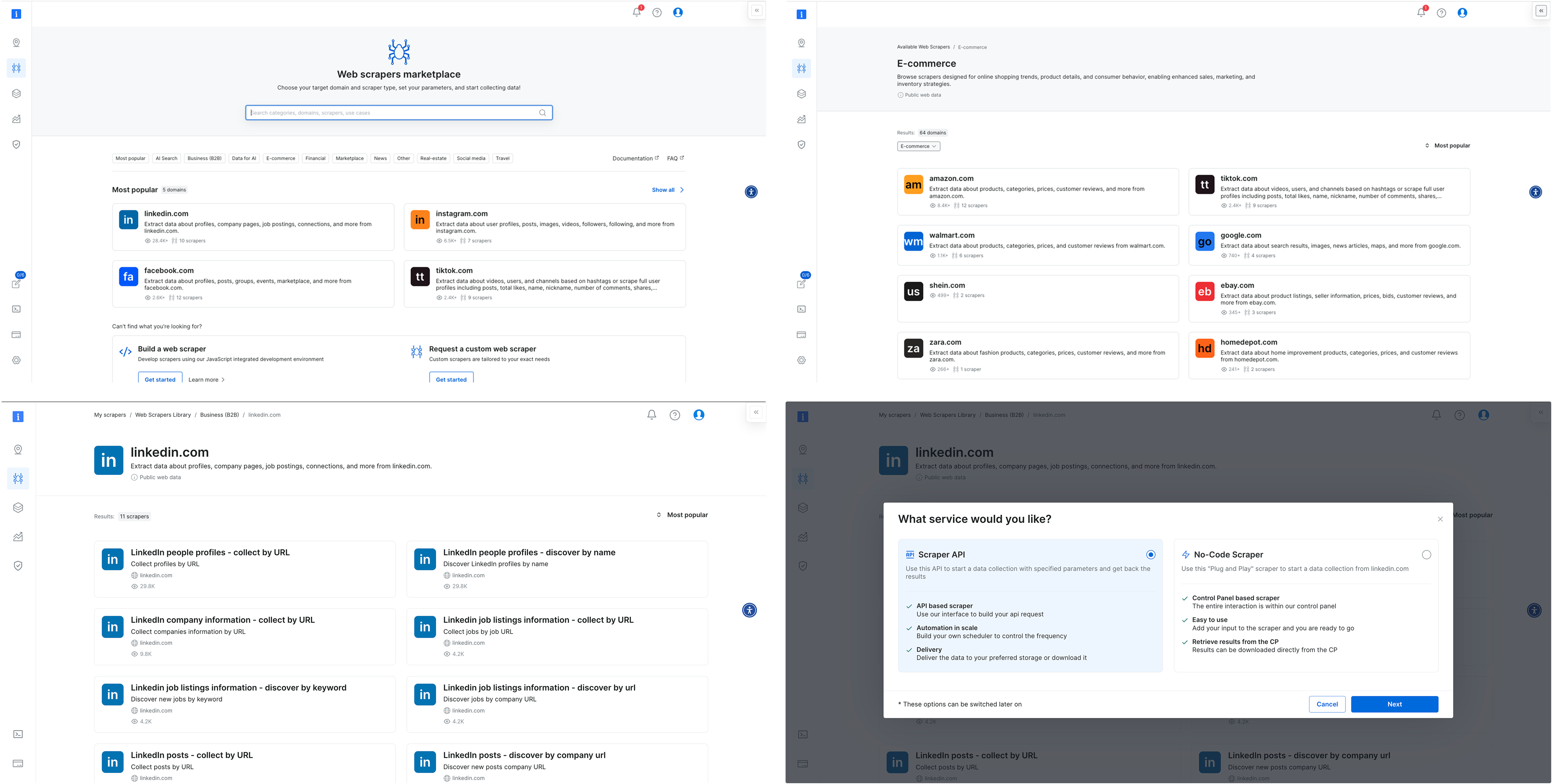
To address the confusion between Scrapers and Datasets, I designed a new search results page that highlights both offerings side by side, tailored to the specific domain selected by the user on our commercial website. This allowed users to quickly compare and understand which solution best fit their needs, reducing friction in the PLG onboarding flow.
The UI presented both Scrapers and Datasets in a unified layout, using consistent visual elements and category tags to distinguish them clearly. This was a pragmatic solution that improved user clarity without overhauling the entire marketplace.
However, this design surfaced a broader product challenge: our platform essentially hosts two separate marketplaces. We added this to our backlog to explore a long-term strategy for unifying or better differentiating these experiences.
Research & Discovery
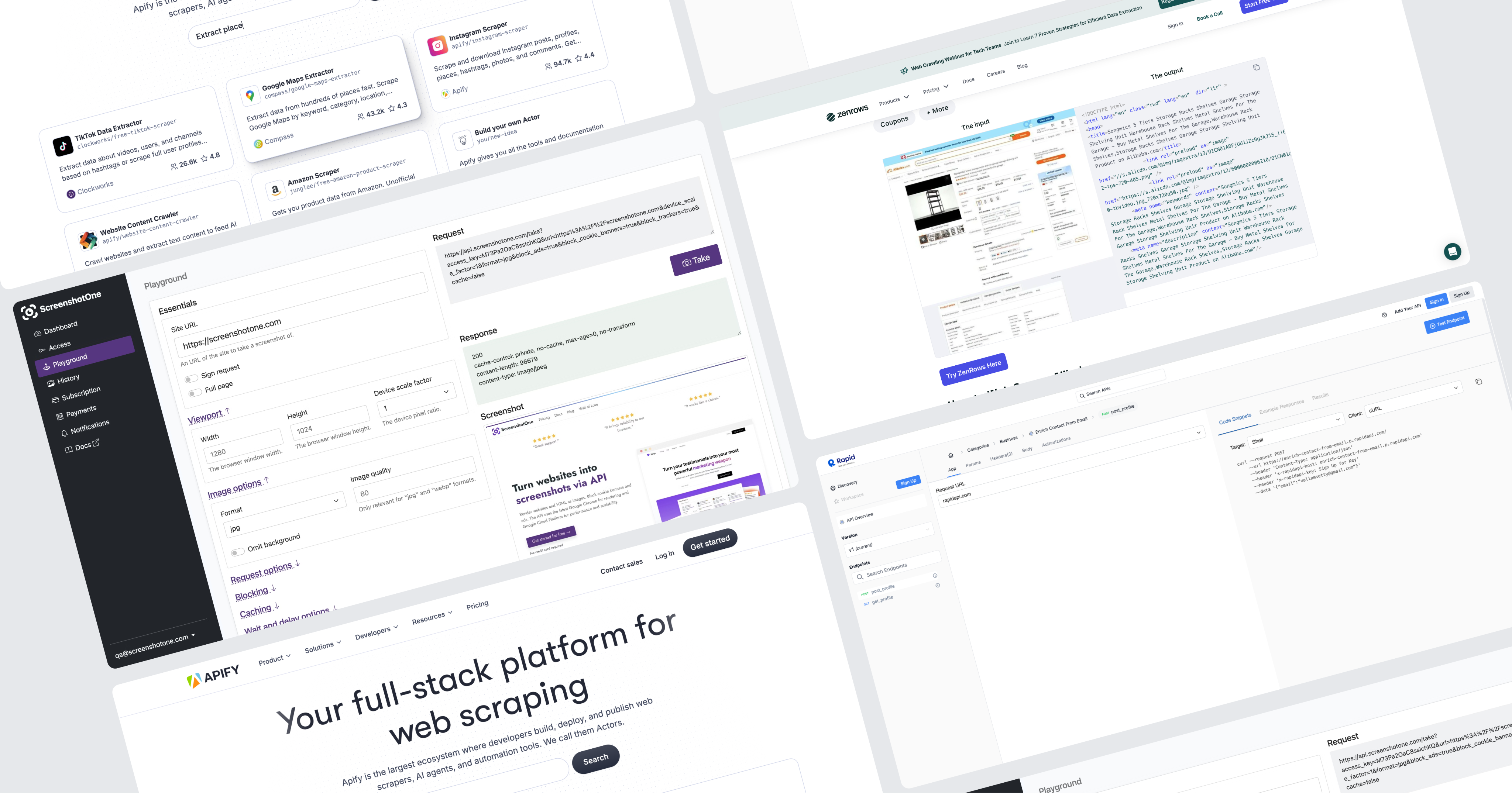
To kick off this project I initiated a competitive analysis, focusing on 2–4 key competitors. My goal was to identify established design patterns and best practices we could leverage.
Since Bright Data is not the only company offering web scraping solutions, aligning with familiar interaction models was a strategic move to reduce user friction and increase trust. As part of the discovery phase, I also set out to validate our understanding of the target audience. However, it quickly became clear that we lacked sufficient data about our primary user personas.
This gap highlighted the need for additional user research to ensure the new solution would be truly user-centered.
Persona who?
Finding Fast Wins and Uncovering Gaps
With tight deadlines, I collaborated with the product team to gather qualitative insights from customer success and sales teams. Then we quickly launched a simple user onboarding.
We were concentrated on two key questions:
#1
What is your role?
#2
How do you plan to use Bright Data?
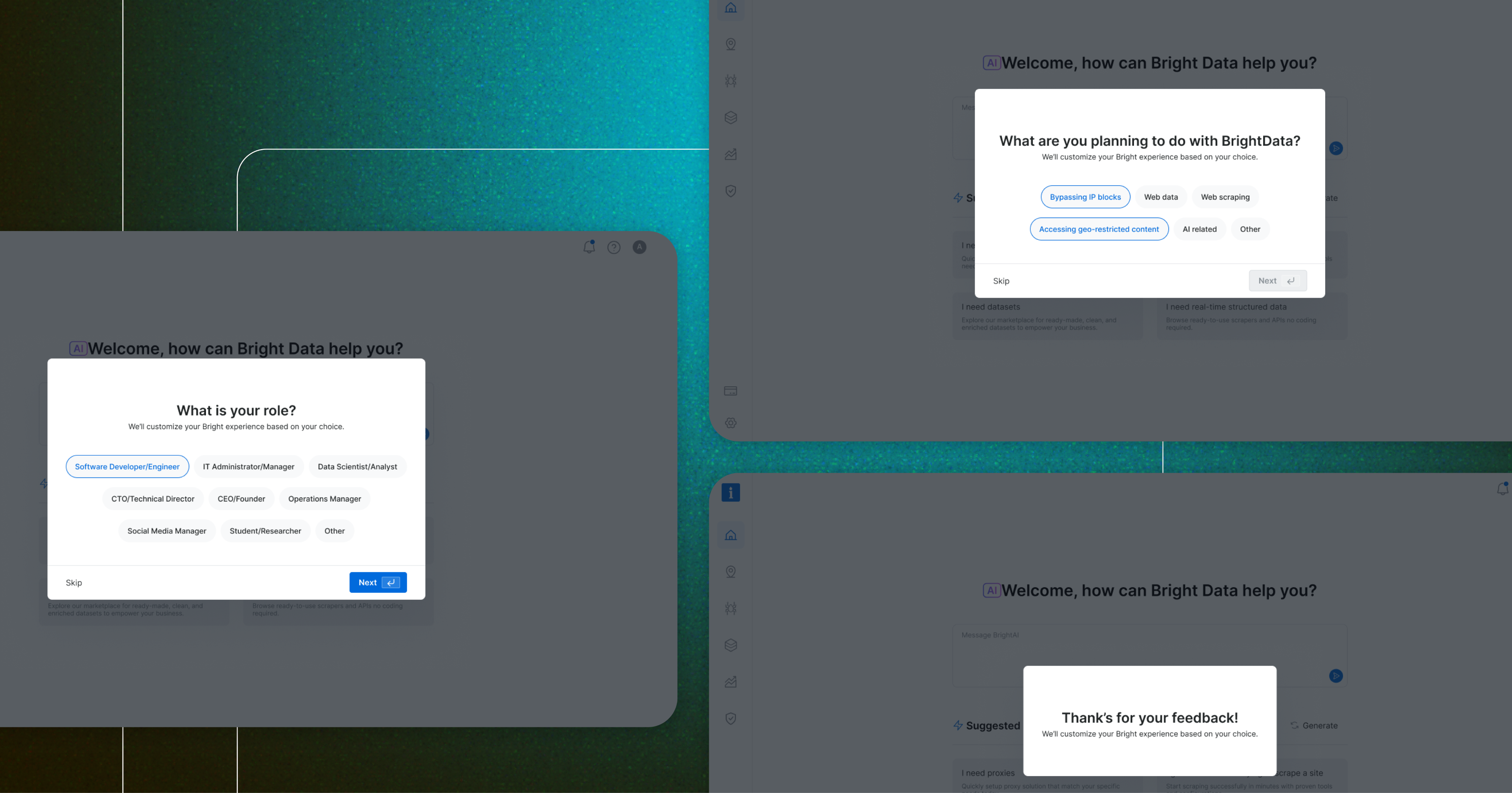
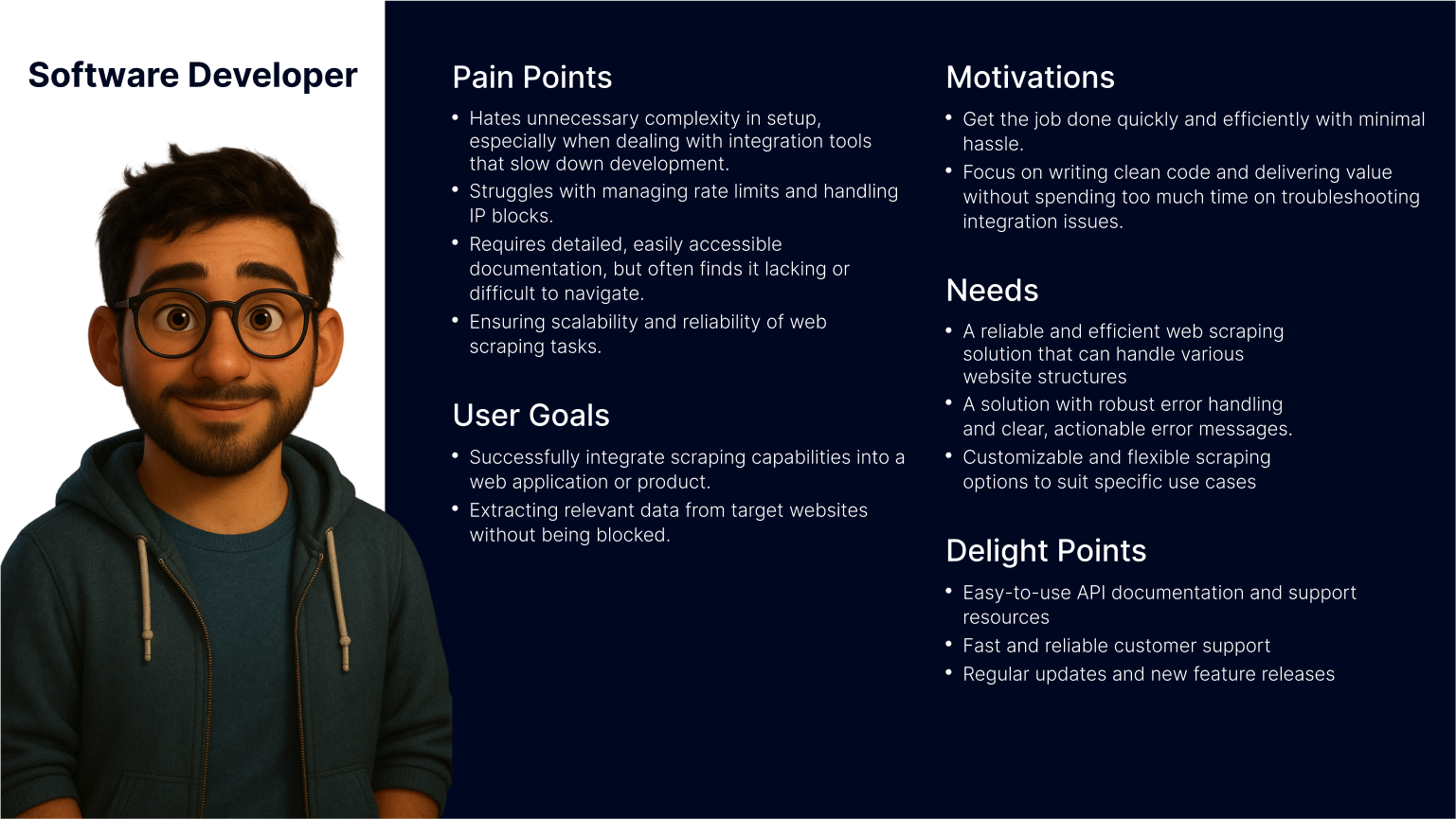
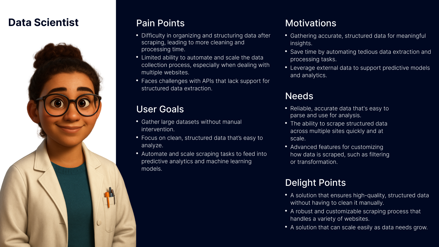
This research revealed that our primary users are software developers and data scientists. Now I fee confident to move forward with crafting a user-centered solution that addresses their unique needs and workflows.
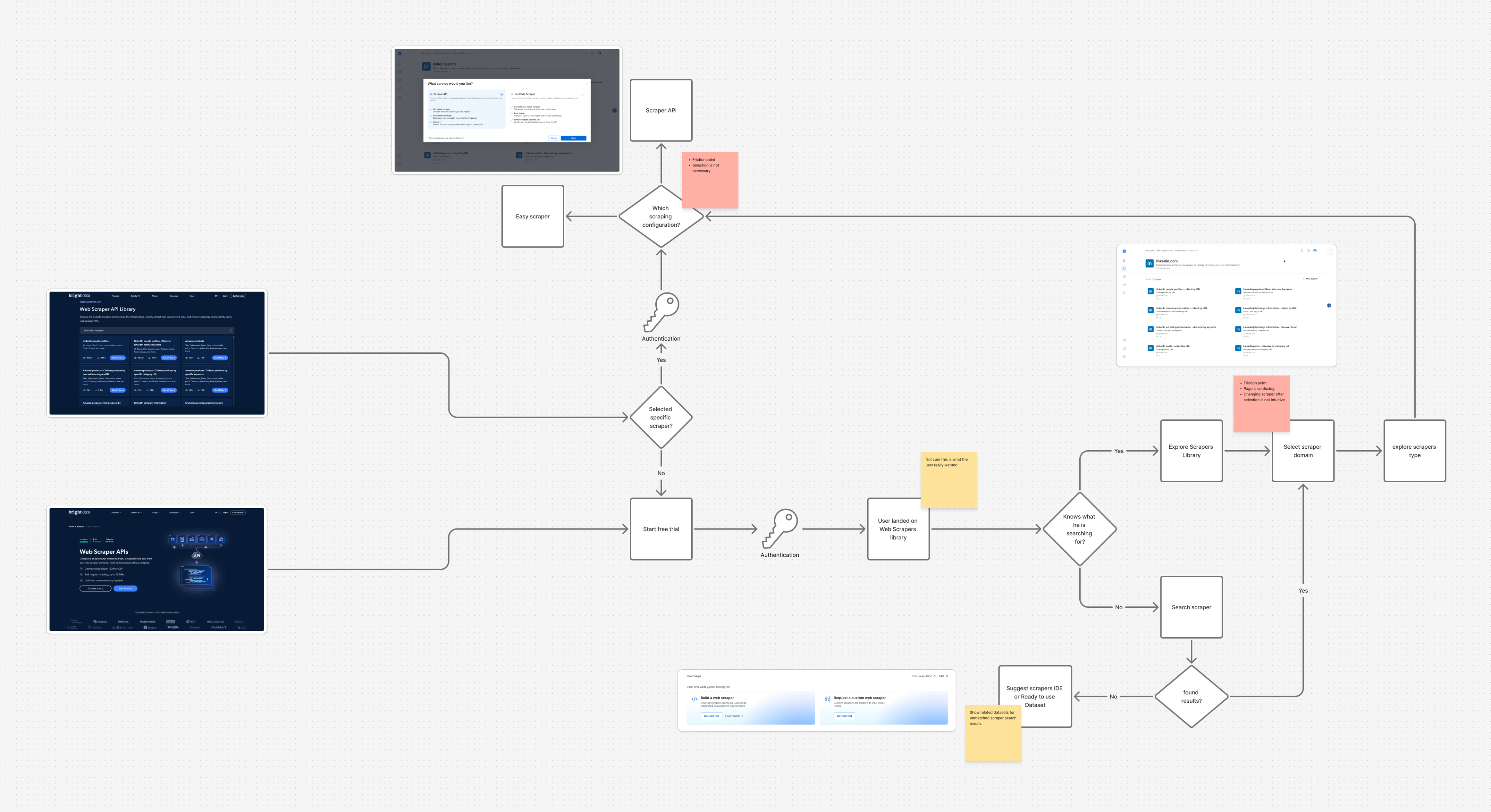
After defining our user personas, I turned to the existing product experience to map key user flows, from landing on the Web Scraper API library to configuring and executing a scraper. This end-to-end review helped surface critical friction points, misaligned interactions, and moments of user hesitation. By analyzing these flows, we were able to clarify our design goals and establish how we would measure success in the improved experience.
Throughout the process, we collaborated closely with product and data teams to identify and validate the most relevant product metrics to support our findings and ensure we were solving the right problems.
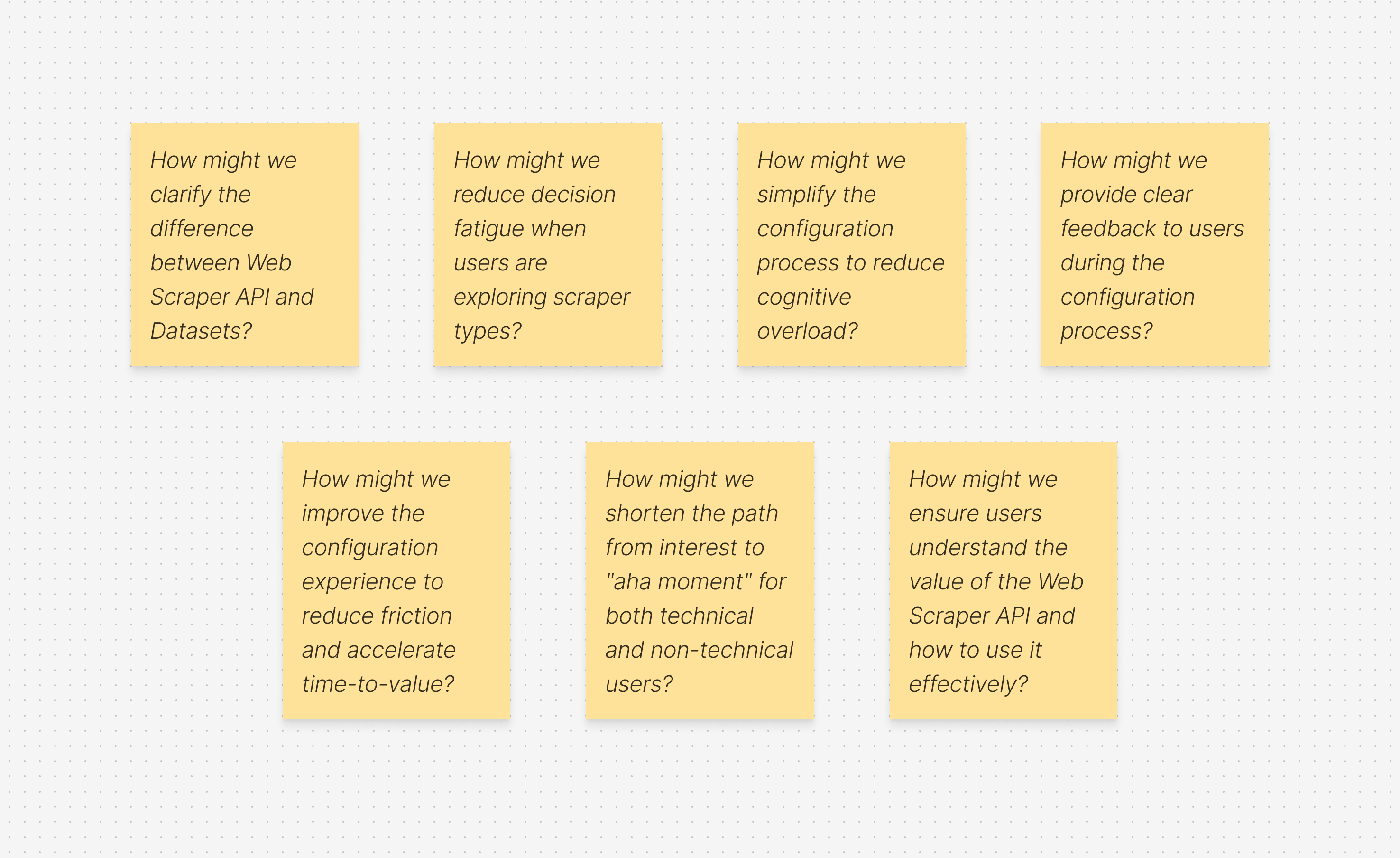
How Might We?
Defining “How Might We” (HMW) questions helped me focus on solving the right problems before jumping into design exploration. It was a crucial step in narrowing the scope and prioritizing what would deliver the most value.
As a product designer working on complex systems, one of the biggest challenges is balancing ambition with practicality, there are countless opportunities to improve the experience, but we need to move incrementally so we can measure impact and iterate with confidence. At the same time, we have to be careful not to “move the cheese” too drastically, ensuring continuity for existing users while evolving the product
Current Experience
key changes
Prioritizing User Intent and Reducing Cognitive Load
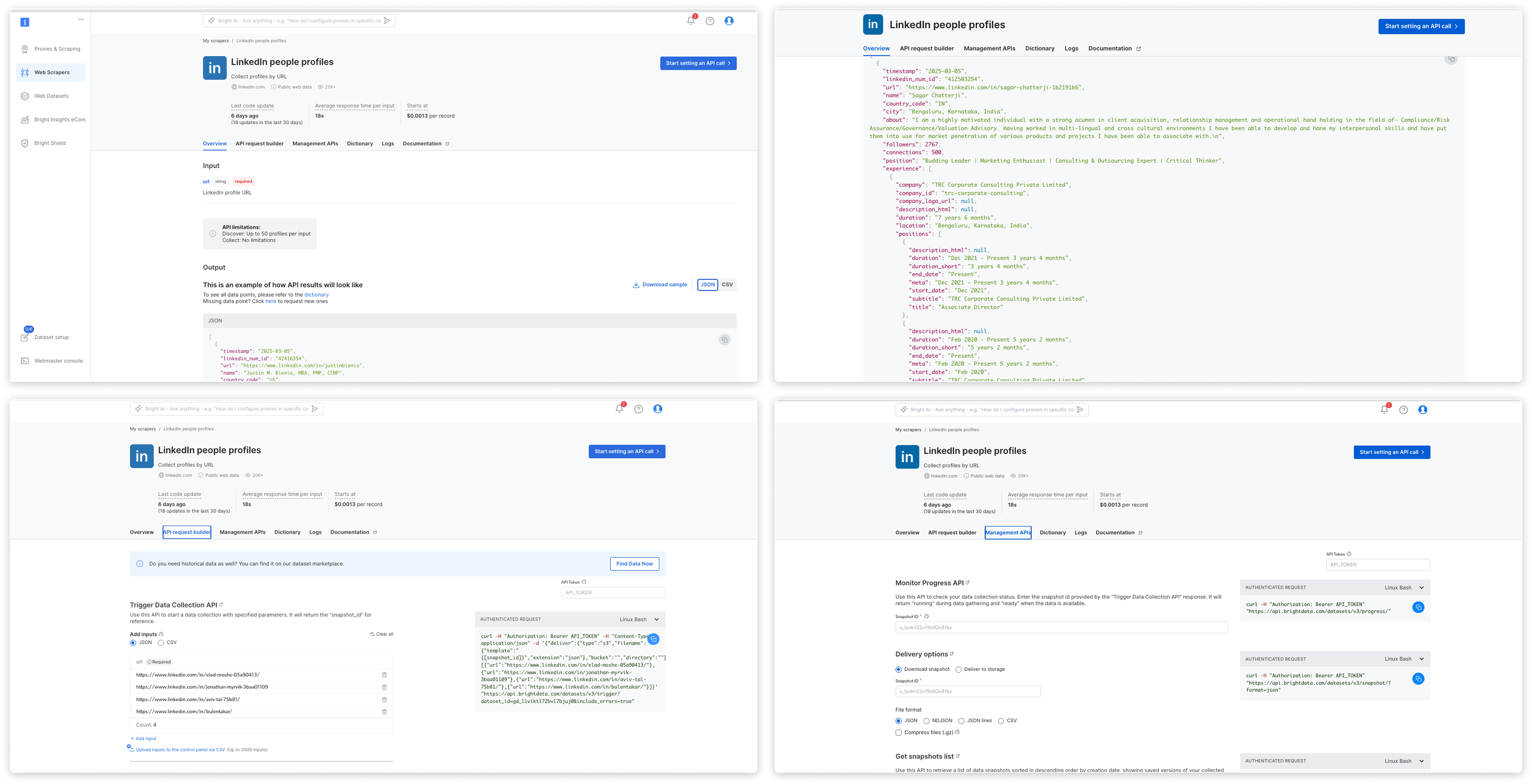
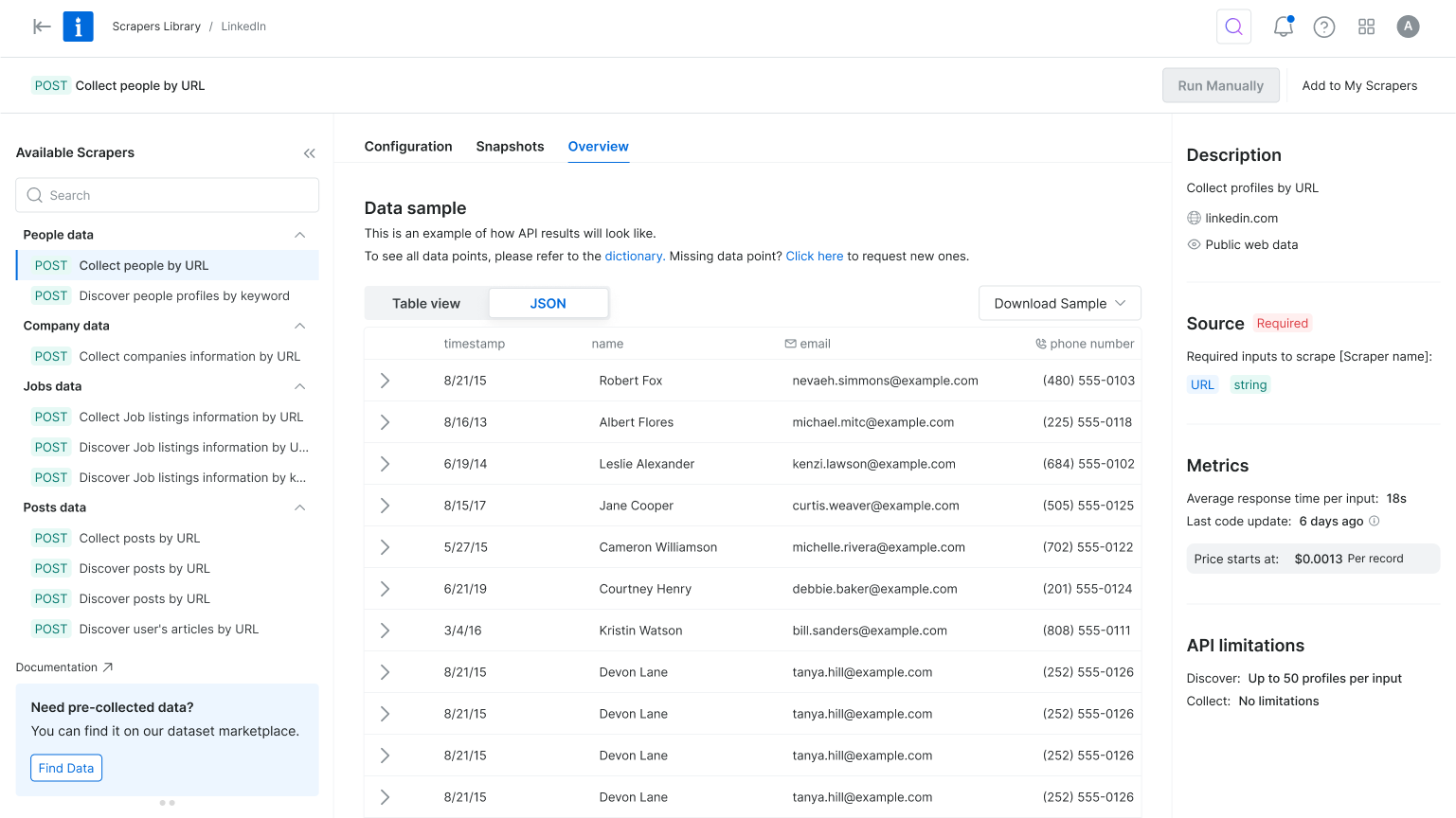
In the original flow, users landed on the scraper overview page, but product metrics showed they quickly skipped past it to reach the configuration page. To reduce friction and align with user intent, we reordered the tabs to place configuration first and focused the interface on only the essential settings. This simplified the experience, reduced cognitive load, and helped users reach value faster.
Simplifying Exploration
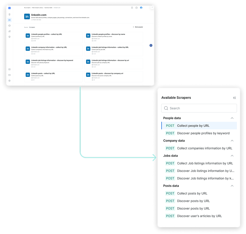
The original interface made it hard to differentiate between scrapers—each looked nearly identical, with little context to support decision-making. Once a scraper was selected, switching to another meant starting the entire setup process from scratch. To streamline exploration and reduce friction, we introduced a tree view for easier navigation within each domain, enabled flexible scraper switching mid-flow, and highlighted the delivery method to help technical users make faster, more informed choices.
Focus on Essentials
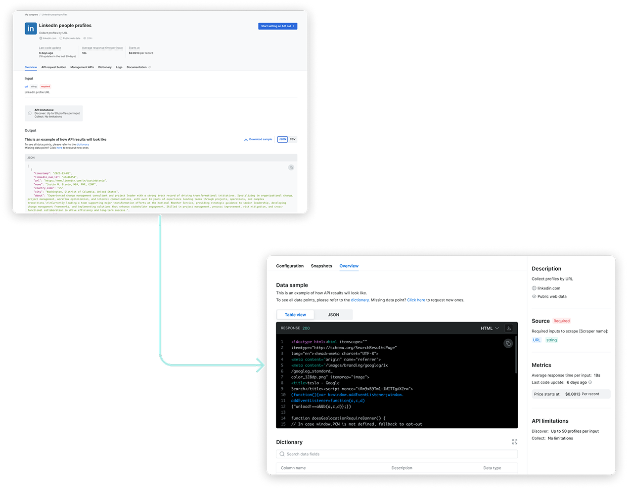
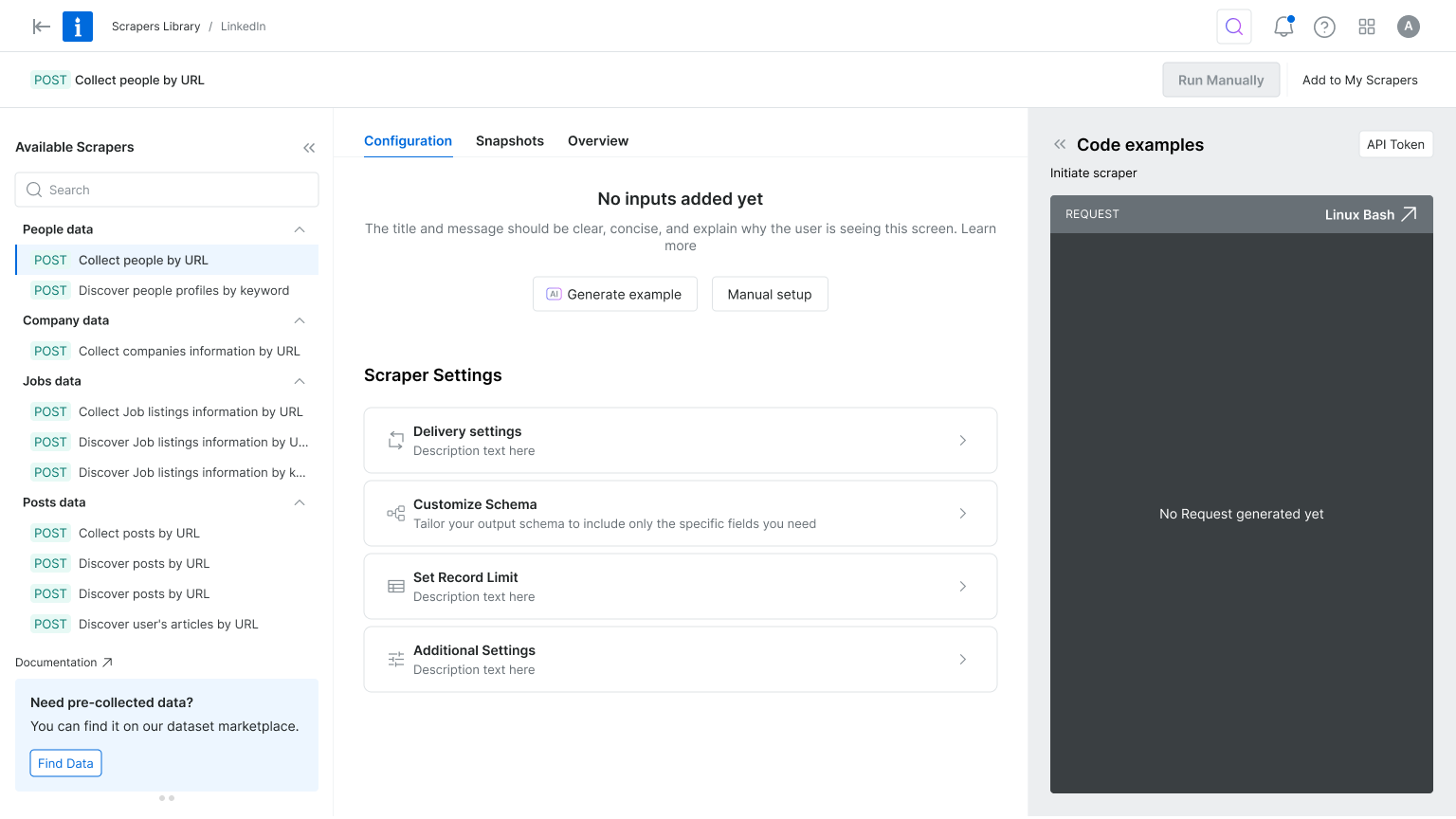
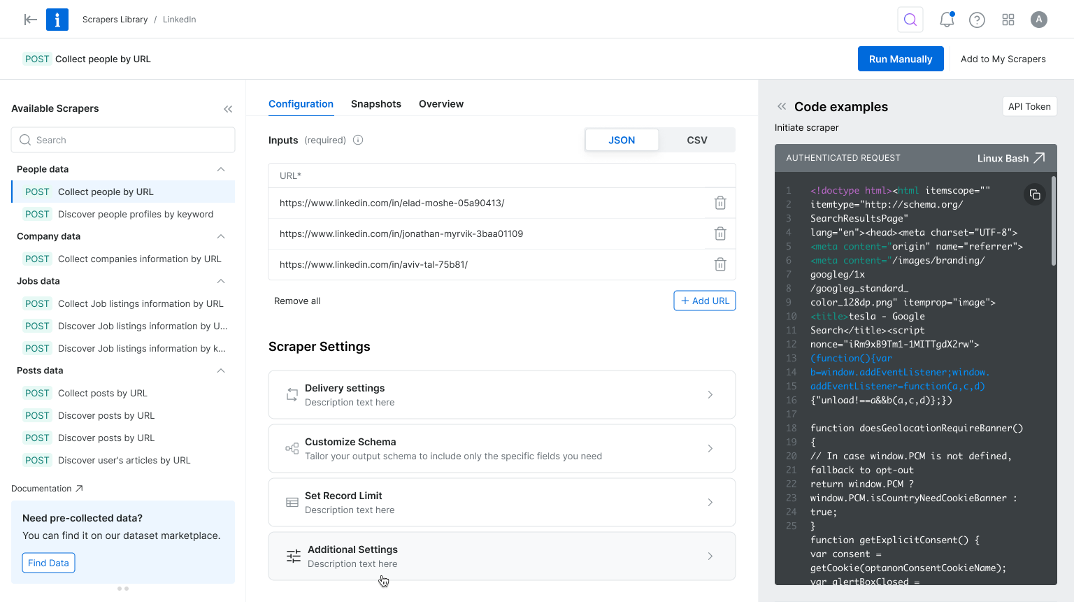
The configuration experience felt overwhelming—especially for first-time users. While flexibility was a strength, the abundance of options created friction and delayed activation. To simplify the process, we focused the UI on essential settings and tucked advanced options into expandable menus. We also enhanced the code preview and response area to give users better feedback, helping them stay focused and reinforcing a sense of progress from the start.
Where Strategy Meets Visual Design
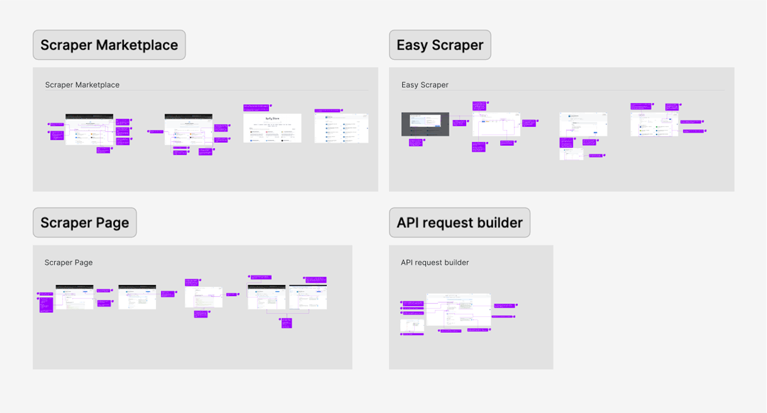
The design process was a collaborative effort between product and I, ensuring that the final solution met both user needs and business goals. We started by creating low-fidelity wireframes to explore different layout options and interactions. This allowed us to quickly iterate on ideas and gather feedback from stakeholders before moving on to high-fidelity designs.
New Scrapers Library Experience
New Product Onboarding Experience
New Web Scraper Configuration Experience
Want to hear more?


Next Projects
Homepage & Navigation

Back to top

keren scheinkman
2025, Built with love in Figma sites, by Keren Scheinkman.
keren scheinkman
HOME
WORK
ABOUT
Web Scraper API
2025
Reduce friction. Accelerate value. Drive conversion.
Company
Bright Data
Timeline
1 month
Role
Senior Product Designer
Responsibilities
Lead Designer • User research • UX • UI
The Team
PM, PMM, Dev Team
What is Web Scraper API?
You are a data-driven professional looking to stay on top of competitor pricing, customer reviews, or hiring trends.But manually gathering that information from dozens of websites takes too much time. Web Scraper API does the heavy lifting for you, automatically collecting and organizing information from over 120 popular websites into a clear, usable format, so you can spend more time making decisions and less time hunting for data.
the problem
Key configuration pages lost 70% of their conversion rate
Step #1 - heuristic evaluation
To kick off the project, I conducted a heuristic evaluation. This helped identify usability issues, frame the key problem areas, and prioritize improvement opportunities. The process also allowed me to align early with the product manager and developers, ensuring we accounted for technical limitations and existing constraints.
At Bright Data, stakeholders are deeply interested in understanding the rationale behind design decisions. Presenting a heuristic evaluation report, paired with usage metrics, served as a compelling way to highlight usability gaps and opportunities for growth. This evaluation laid the groundwork for cross-functional alignment and ultimately informed our design roadmap.
PLG User Journey
During the heuristic evaluation, we discovered a major usability issue affecting our Product-Led Growth (PLG) funnel, particularly right after login. Users were consistently confused between two core offerings, Scrapers and Datasets, due to overlapping terminology and unclear visual hierarchy.
Recognizing that this confusion could hurt user activation and retention, I worked with the team to temporarily shift focus and address the PLG experience. We agreed to quickly prototype and test improvements to clarify this distinction and guide users more effectively through the post-login journey.
Findings
Key Challenges
#1
Unclear messaging
Users were confused between the Web Scraper API and Datasets offerings.
#2
Unexpected results
The existing design lacked basic UX patterns.
Actions often produced unexpected outcomes, leading to user confusion and mistrust.
#3
Confusing navigation
Users struggled to understand where they were in the process due to unclear page titles and unclear CTAs.
#4
Lack of feedback
After running an API call there was not visual feedback to indicate progress, leaving users unsure if their actions were successful.
#5
Cognitive overload
Configuration forms UX asked for too many details upfront, overwhelming first-time users and delaying their "aha" moment
Create quick solution for the PLG flow...
To address the confusion between Scrapers and Datasets, I designed a new search results page that highlights both offerings side by side, tailored to the specific domain selected by the user on our commercial website. This allowed users to quickly compare and understand which solution best fit their needs, reducing friction in the PLG onboarding flow.
The UI presented both Scrapers and Datasets in a unified layout, using consistent visual elements and category tags to distinguish them clearly. This was a pragmatic solution that improved user clarity without overhauling the entire marketplace.
However, this design surfaced a broader product challenge: our platform essentially hosts two separate marketplaces. We added this to our backlog to explore a long-term strategy for unifying or better differentiating these experiences.
Research & Discovery
To kick off this project I initiated a competitive analysis, focusing on 2–4 key competitors. My goal was to identify established design patterns and best practices we could leverage.
Since Bright Data is not the only company offering web scraping solutions, aligning with familiar interaction models was a strategic move to reduce user friction and increase trust. As part of the discovery phase, I also set out to validate our understanding of the target audience. However, it quickly became clear that we lacked sufficient data about our primary user personas.
This gap highlighted the need for additional user research to ensure the new solution would be truly user-centered.
Persona who?
Finding Fast Wins and Uncovering Gaps
With tight deadlines, I collaborated with the product team to gather qualitative insights from customer success and sales teams. Then we quickly launched a simple user onboarding.
We were concentrated on two key questions:
#1
What is your role?
#2
How do you plan to use Bright Data?
This research revealed that our primary users are software developers and data scientists. Now I fee confident to move forward with crafting a user-centered solution that addresses their unique needs and workflows.
After defining our user personas, I turned to the existing product experience to map key user flows, from landing on the Web Scraper API library to configuring and executing a scraper. This end-to-end review helped surface critical friction points, misaligned interactions, and moments of user hesitation. By analyzing these flows, we were able to clarify our design goals and establish how we would measure success in the improved experience.
Throughout the process, we collaborated closely with product and data teams to identify and validate the most relevant product metrics to support our findings and ensure we were solving the right problems.
How Might We?
Defining “How Might We” (HMW) questions helped me focus on solving the right problems before jumping into design exploration. It was a crucial step in narrowing the scope and prioritizing what would deliver the most value.
As a product designer working on complex systems, one of the biggest challenges is balancing ambition with practicality, there are countless opportunities to improve the experience, but we need to move incrementally so we can measure impact and iterate with confidence. At the same time, we have to be careful not to “move the cheese” too drastically, ensuring continuity for existing users while evolving the product
Current Experience
key changes
Prioritizing User Intent and Reducing Cognitive Load
In the original flow, users landed on the scraper overview page, but product metrics showed they quickly skipped past it to reach the configuration page. To reduce friction and align with user intent, we reordered the tabs to place configuration first and focused the interface on only the essential settings. This simplified the experience, reduced cognitive load, and helped users reach value faster.
Simplifying Exploration
The original interface made it hard to differentiate between scrapers—each looked nearly identical, with little context to support decision-making. Once a scraper was selected, switching to another meant starting the entire setup process from scratch. To streamline exploration and reduce friction, we introduced a tree view for easier navigation within each domain, enabled flexible scraper switching mid-flow, and highlighted the delivery method to help technical users make faster, more informed choices.
Focus on Essentials
The configuration experience felt overwhelming—especially for first-time users. While flexibility was a strength, the abundance of options created friction and delayed activation. To simplify the process, we focused the UI on essential settings and tucked advanced options into expandable menus. We also enhanced the code preview and response area to give users better feedback, helping them stay focused and reinforcing a sense of progress from the start.
Where Strategy Meets Visual Design
The design process was a collaborative effort between product and I, ensuring that the final solution met both user needs and business goals. We started by creating low-fidelity wireframes to explore different layout options and interactions. This allowed us to quickly iterate on ideas and gather feedback from stakeholders before moving on to high-fidelity designs.
New Scrapers Library Experience
New Product Onboarding Experience
New Web Scraper Configuration Experience
Want to hear more?
Next Projects
Homepage & Navigation
Back to top
keren scheinkman
2025, Built with love in Figma sites, by Keren Scheinkman.
keren scheinkman
HOME
WORK
ABOUT
Web Scraper API
2025
Reduce friction. Accelerate value. Drive conversion.
Company
Bright Data
Timeline
1 month
Role
Senior Product Designer
Responsibilities
Lead Designer • User research • UX • UI
The Team
PM, PMM, Dev Team
What is Web Scraper API?
You are a data-driven professional looking to stay on top of competitor pricing, customer reviews, or hiring trends.But manually gathering that information from dozens of websites takes too much time. Web Scraper API does the heavy lifting for you, automatically collecting and organizing information from over 120 popular websites into a clear, usable format, so you can spend more time making decisions and less time hunting for data.
the problem
Key configuration pages lost 70% of their conversion rate
Step #1 - heuristic evaluation
To kick off the project, I conducted a heuristic evaluation. This helped identify usability issues, frame the key problem areas, and prioritize improvement opportunities. The process also allowed me to align early with the product manager and developers, ensuring we accounted for technical limitations and existing constraints.
At Bright Data, stakeholders are deeply interested in understanding the rationale behind design decisions. Presenting a heuristic evaluation report, paired with usage metrics, served as a compelling way to highlight usability gaps and opportunities for growth. This evaluation laid the groundwork for cross-functional alignment and ultimately informed our design roadmap.
PLG User Journey
During the heuristic evaluation, we discovered a major usability issue affecting our Product-Led Growth (PLG) funnel, particularly right after login. Users were consistently confused between two core offerings, Scrapers and Datasets, due to overlapping terminology and unclear visual hierarchy.
Recognizing that this confusion could hurt user activation and retention, I worked with the team to temporarily shift focus and address the PLG experience. We agreed to quickly prototype and test improvements to clarify this distinction and guide users more effectively through the post-login journey.
Findings
Key Challenges
#1
Unclear messaging
Users were confused between the Web Scraper API and Datasets offerings.
#2
Unexpected results
The existing design lacked basic UX patterns.
Actions often produced unexpected outcomes, leading to user confusion and mistrust.
#3
Confusing navigation
Users struggled to understand where they were in the process due to unclear page titles and unclear CTAs.
#4
Lack of feedback
After running an API call there was not visual feedback to indicate progress, leaving users unsure if their actions were successful.
#5
Cognitive overload
Configuration forms UX asked for too many details upfront, overwhelming first-time users and delaying their "aha" moment
Create quick solution for the PLG flow...
To address the confusion between Scrapers and Datasets, I designed a new search results page that highlights both offerings side by side, tailored to the specific domain selected by the user on our commercial website. This allowed users to quickly compare and understand which solution best fit their needs, reducing friction in the PLG onboarding flow.
The UI presented both Scrapers and Datasets in a unified layout, using consistent visual elements and category tags to distinguish them clearly. This was a pragmatic solution that improved user clarity without overhauling the entire marketplace.
However, this design surfaced a broader product challenge: our platform essentially hosts two separate marketplaces. We added this to our backlog to explore a long-term strategy for unifying or better differentiating these experiences.
Research & Discovery
To kick off this project I initiated a competitive analysis, focusing on 2–4 key competitors. My goal was to identify established design patterns and best practices we could leverage.
Since Bright Data is not the only company offering web scraping solutions, aligning with familiar interaction models was a strategic move to reduce user friction and increase trust. As part of the discovery phase, I also set out to validate our understanding of the target audience. However, it quickly became clear that we lacked sufficient data about our primary user personas.
This gap highlighted the need for additional user research to ensure the new solution would be truly user-centered.
Persona who?
Finding Fast Wins and Uncovering Gaps
With tight deadlines, I collaborated with the product team to gather qualitative insights from customer success and sales teams. Then we quickly launched a simple user onboarding.
We were concentrated on two key questions:
#1
What is your role?
#2
How do you plan to use Bright Data?
This research revealed that our primary users are software developers and data scientists. Now I fee confident to move forward with crafting a user-centered solution that addresses their unique needs and workflows.
After defining our user personas, I turned to the existing product experience to map key user flows, from landing on the Web Scraper API library to configuring and executing a scraper. This end-to-end review helped surface critical friction points, misaligned interactions, and moments of user hesitation. By analyzing these flows, we were able to clarify our design goals and establish how we would measure success in the improved experience.
Throughout the process, we collaborated closely with product and data teams to identify and validate the most relevant product metrics to support our findings and ensure we were solving the right problems.
How Might We?
Defining “How Might We” (HMW) questions helped me focus on solving the right problems before jumping into design exploration. It was a crucial step in narrowing the scope and prioritizing what would deliver the most value.
As a product designer working on complex systems, one of the biggest challenges is balancing ambition with practicality, there are countless opportunities to improve the experience, but we need to move incrementally so we can measure impact and iterate with confidence. At the same time, we have to be careful not to “move the cheese” too drastically, ensuring continuity for existing users while evolving the product
Current Experience
key changes
Prioritizing User Intent and Reducing Cognitive Load
In the original flow, users landed on the scraper overview page, but product metrics showed they quickly skipped past it to reach the configuration page. To reduce friction and align with user intent, we reordered the tabs to place configuration first and focused the interface on only the essential settings. This simplified the experience, reduced cognitive load, and helped users reach value faster.
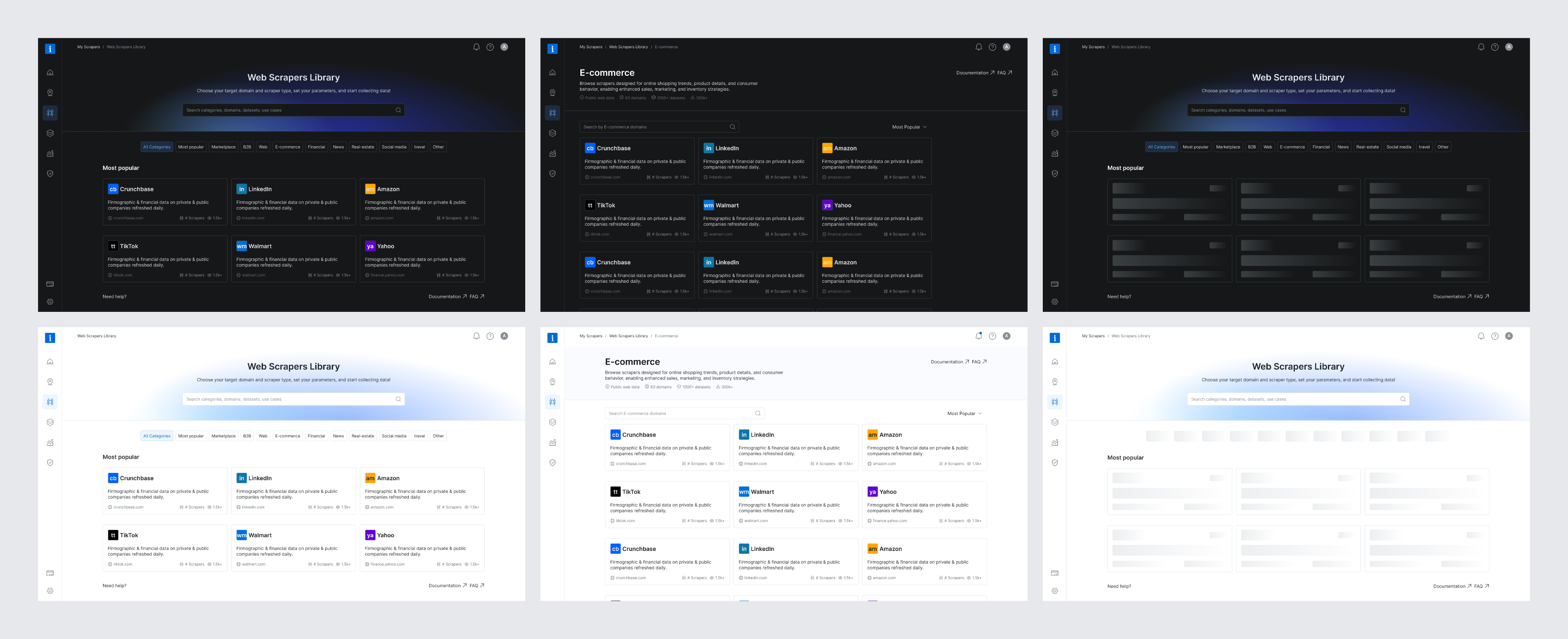
Simplifying Exploration
The original interface made it hard to differentiate between scrapers—each looked nearly identical, with little context to support decision-making. Once a scraper was selected, switching to another meant starting the entire setup process from scratch. To streamline exploration and reduce friction, we introduced a tree view for easier navigation within each domain, enabled flexible scraper switching mid-flow, and highlighted the delivery method to help technical users make faster, more informed choices.
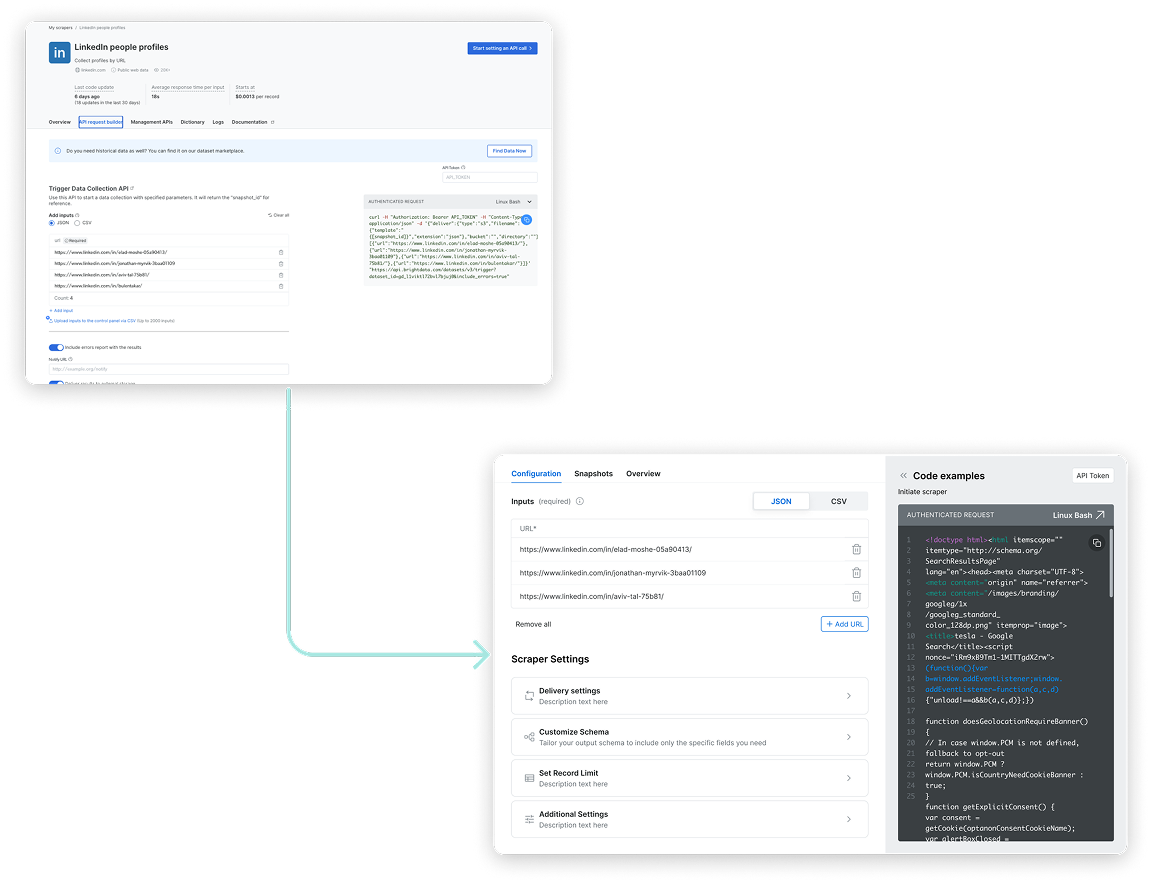
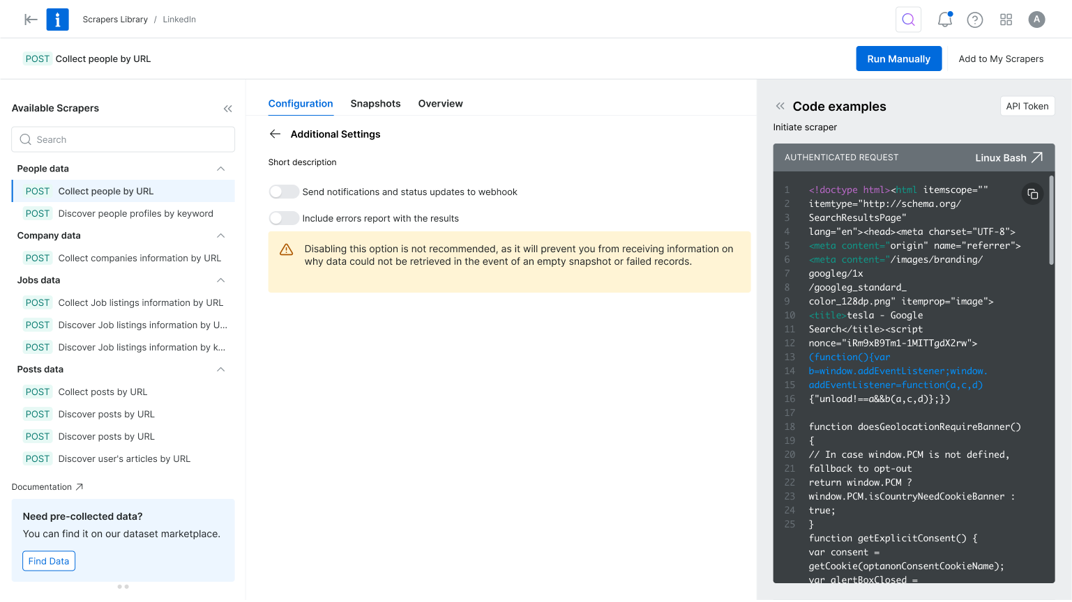
Focus on Essentials
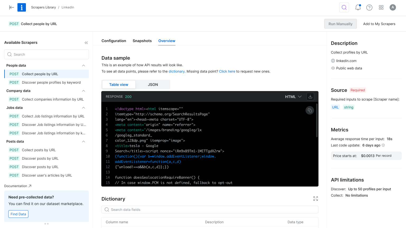
The configuration experience felt overwhelming—especially for first-time users. While flexibility was a strength, the abundance of options created friction and delayed activation. To simplify the process, we focused the UI on essential settings and tucked advanced options into expandable menus. We also enhanced the code preview and response area to give users better feedback, helping them stay focused and reinforcing a sense of progress from the start.
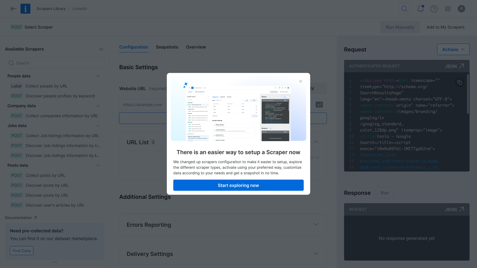
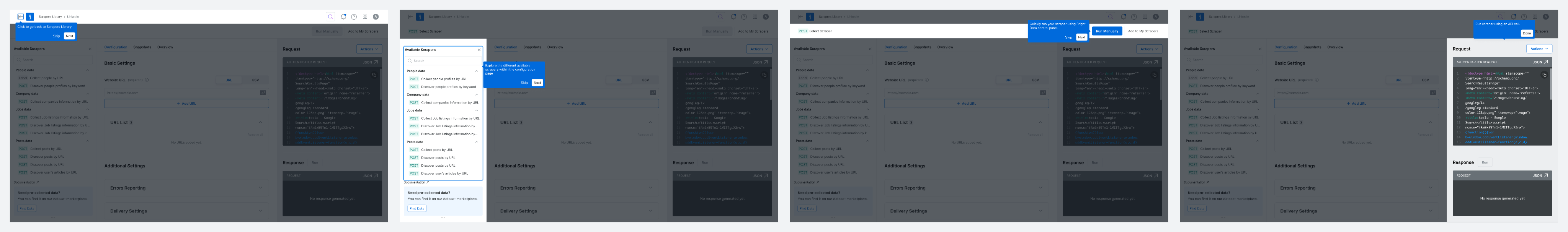
Where Strategy Meets Visual Design
The design process was a collaborative effort between product and I, ensuring that the final solution met both user needs and business goals. We started by creating low-fidelity wireframes to explore different layout options and interactions. This allowed us to quickly iterate on ideas and gather feedback from stakeholders before moving on to high-fidelity designs.
New Scrapers Library Experience
New Product Onboarding Experience
New Web Scraper Configuration Experience
Want to hear more?
Next Projects
Homepage & Navigation
Back to top
keren scheinkman
2025, Built with love in Figma sites, by Keren Scheinkman.
keren scheinkman
HOME
WORK
ABOUT
Web Scraper API
2025
Reduce friction. Accelerate value. Drive conversion.
Company
Bright Data
Timeline
1 month
Role
Senior Product Designer
Responsibilities
Lead Designer • User research • UX • UI
The Team
PM, PMM, Dev Team
What is Web Scraper API?
You are a data-driven professional looking to stay on top of competitor pricing, customer reviews, or hiring trends.But manually gathering that information from dozens of websites takes too much time. Web Scraper API does the heavy lifting for you, automatically collecting and organizing information from over 120 popular websites into a clear, usable format, so you can spend more time making decisions and less time hunting for data.
the problem
Key configuration pages lost 70% of their conversion rate
Step #1 - heuristic evaluation
To kick off the project, I conducted a heuristic evaluation. This helped identify usability issues, frame the key problem areas, and prioritize improvement opportunities. The process also allowed me to align early with the product manager and developers, ensuring we accounted for technical limitations and existing constraints.
At Bright Data, stakeholders are deeply interested in understanding the rationale behind design decisions. Presenting a heuristic evaluation report, paired with usage metrics, served as a compelling way to highlight usability gaps and opportunities for growth. This evaluation laid the groundwork for cross-functional alignment and ultimately informed our design roadmap.
PLG User Journey
During the heuristic evaluation, we discovered a major usability issue affecting our Product-Led Growth (PLG) funnel, particularly right after login. Users were consistently confused between two core offerings, Scrapers and Datasets, due to overlapping terminology and unclear visual hierarchy.
Recognizing that this confusion could hurt user activation and retention, I worked with the team to temporarily shift focus and address the PLG experience. We agreed to quickly prototype and test improvements to clarify this distinction and guide users more effectively through the post-login journey.
Findings
Key Challenges
#1
Unclear messaging
Users were confused between the Web Scraper API and Datasets offerings.
#2
Unexpected results
The existing design lacked basic UX patterns.
Actions often produced unexpected outcomes, leading to user confusion and mistrust.
#3
Confusing navigation
Users struggled to understand where they were in the process due to unclear page titles and unclear CTAs.
#4
Lack of feedback
After running an API call there was not visual feedback to indicate progress, leaving users unsure if their actions were successful.
#5
Cognitive overload
Configuration forms UX asked for too many details upfront, overwhelming first-time users and delaying their "aha" moment
Create quick solution for the PLG flow...
To address the confusion between Scrapers and Datasets, I designed a new search results page that highlights both offerings side by side, tailored to the specific domain selected by the user on our commercial website. This allowed users to quickly compare and understand which solution best fit their needs, reducing friction in the PLG onboarding flow.
The UI presented both Scrapers and Datasets in a unified layout, using consistent visual elements and category tags to distinguish them clearly. This was a pragmatic solution that improved user clarity without overhauling the entire marketplace.
However, this design surfaced a broader product challenge: our platform essentially hosts two separate marketplaces. We added this to our backlog to explore a long-term strategy for unifying or better differentiating these experiences.
Research & Discovery
To kick off this project I initiated a competitive analysis, focusing on 2–4 key competitors. My goal was to identify established design patterns and best practices we could leverage.
Since Bright Data is not the only company offering web scraping solutions, aligning with familiar interaction models was a strategic move to reduce user friction and increase trust. As part of the discovery phase, I also set out to validate our understanding of the target audience. However, it quickly became clear that we lacked sufficient data about our primary user personas.
This gap highlighted the need for additional user research to ensure the new solution would be truly user-centered.
Persona who?
Finding Fast Wins and Uncovering Gaps
With tight deadlines, I collaborated with the product team to gather qualitative insights from customer success and sales teams. Then we quickly launched a simple user onboarding.
We were concentrated on two key questions:
#1
What is your role?
#2
How do you plan to use Bright Data?
This research revealed that our primary users are software developers and data scientists. Now I fee confident to move forward with crafting a user-centered solution that addresses their unique needs and workflows.
After defining our user personas, I turned to the existing product experience to map key user flows, from landing on the Web Scraper API library to configuring and executing a scraper. This end-to-end review helped surface critical friction points, misaligned interactions, and moments of user hesitation. By analyzing these flows, we were able to clarify our design goals and establish how we would measure success in the improved experience.
Throughout the process, we collaborated closely with product and data teams to identify and validate the most relevant product metrics to support our findings and ensure we were solving the right problems.
How Might We?
Defining “How Might We” (HMW) questions helped me focus on solving the right problems before jumping into design exploration. It was a crucial step in narrowing the scope and prioritizing what would deliver the most value.
As a product designer working on complex systems, one of the biggest challenges is balancing ambition with practicality, there are countless opportunities to improve the experience, but we need to move incrementally so we can measure impact and iterate with confidence. At the same time, we have to be careful not to “move the cheese” too drastically, ensuring continuity for existing users while evolving the product
Current Experience
key changes
Prioritizing User Intent and Reducing Cognitive Load
In the original flow, users landed on the scraper overview page, but product metrics showed they quickly skipped past it to reach the configuration page. To reduce friction and align with user intent, we reordered the tabs to place configuration first and focused the interface on only the essential settings. This simplified the experience, reduced cognitive load, and helped users reach value faster.
Simplifying Exploration
The original interface made it hard to differentiate between scrapers—each looked nearly identical, with little context to support decision-making. Once a scraper was selected, switching to another meant starting the entire setup process from scratch. To streamline exploration and reduce friction, we introduced a tree view for easier navigation within each domain, enabled flexible scraper switching mid-flow, and highlighted the delivery method to help technical users make faster, more informed choices.
Focus on Essentials
The configuration experience felt overwhelming—especially for first-time users. While flexibility was a strength, the abundance of options created friction and delayed activation. To simplify the process, we focused the UI on essential settings and tucked advanced options into expandable menus. We also enhanced the code preview and response area to give users better feedback, helping them stay focused and reinforcing a sense of progress from the start.
Where Strategy Meets Visual Design
The design process was a collaborative effort between product and I, ensuring that the final solution met both user needs and business goals. We started by creating low-fidelity wireframes to explore different layout options and interactions. This allowed us to quickly iterate on ideas and gather feedback from stakeholders before moving on to high-fidelity designs.
New Scrapers Library Experience
New Product Onboarding Experience
New Web Scraper Configuration Experience
Want to hear more?
Next Projects
Homepage & Navigation
Back to top
keren scheinkman
2025, Built with love in Figma sites, by Keren Scheinkman.